
One vocabulary, Figma to production.
Following the Bayer Animal Health acquisition, Elanco inherited a fragmented ecosystem spanning 400+ products — and a print-first brand PDF as its only design guidance. As Lead UX Designer & Researcher I owned system definition, interface direction, and product alignment: I audited the component library, then rebuilt the foundation as a Tailwind-aligned system documented in Figma — every token and component carrying its literal utility class name, mirrored 1:1 by engineering in Storybook. Design, code, and docs stopped being translations of each other.
lg 1024 · xl 1280 · 2xl 1536
.config.js
Start with the inventory, not the redesign.
What existed: brand colors and logo usage for print collateral; Open Sans everywhere because a Helvetica Neue license was refused; no icon or illustration set; and CLIB — a component library reverse-engineered from high-fidelity wireframes, marketing-heavy, with no architecture planning behind it. The goal wasn’t to throw everything away — it was to read the UX gaps and answer one question: what do we keep, what do we kill, what gets merged, and what needs enhancing for a real product workflow?
Before designing anything I ran a content inventory and interface audit with Jordan (lead front-end) and Ryan Knopp (solution engineering): every component graded keep, kill, merge, or enhance. The audit is what earned engineering’s trust before a single new component was drawn.
Components sourced from hi-fi wireframes; no discovery, no architecture planning; marketing components outnumbering product primitives.
Full inventory against seven criteria: accessibility, theming, responsiveness, browser support, functionality, maintainability, and Elanco look & feel.
Keep the working primitives, kill the wireframe artifacts, merge duplicates — and rebuild the foundation on a vocabulary engineering already spoke: Tailwind.
Don’t invent a naming layer.
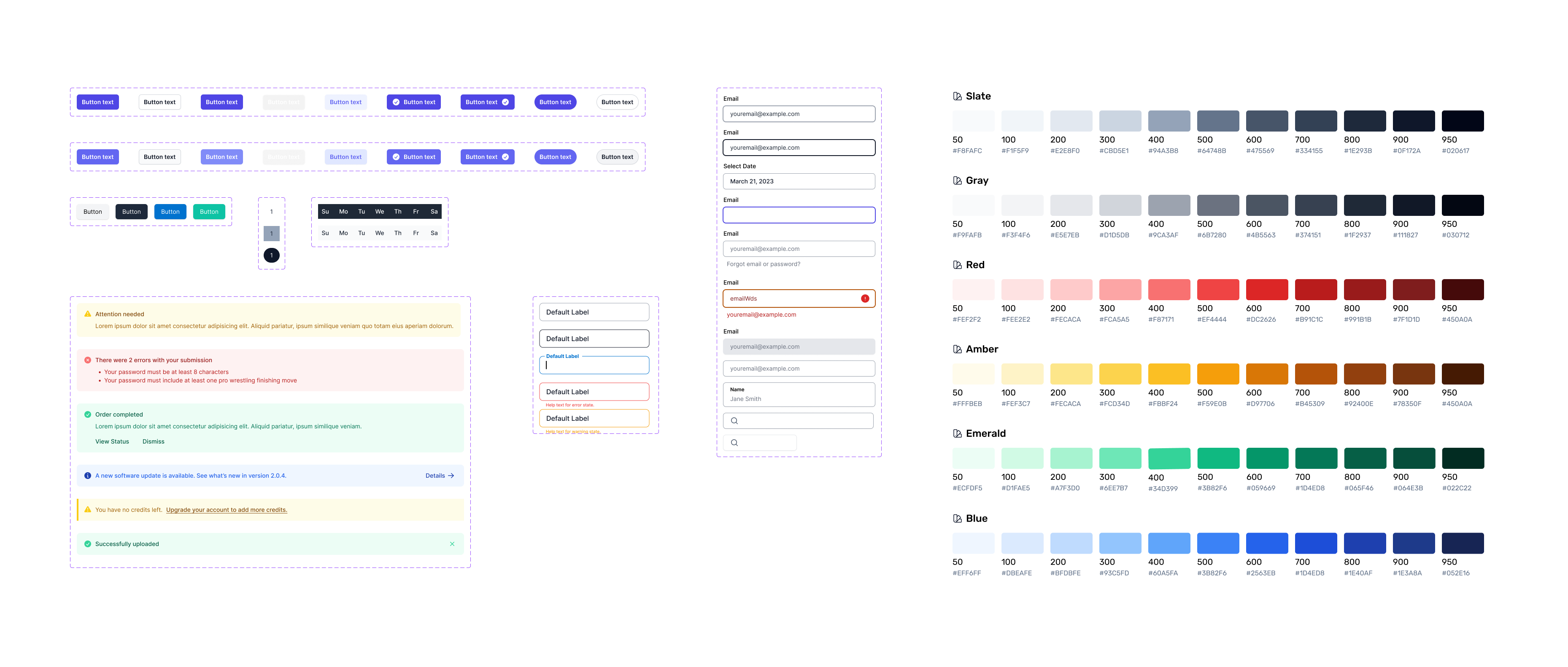
Every color step, type size, spacing value, and breakpoint in the Figma master doc is named by its literal Tailwind utility — so a designer’s spec, an engineer’s markup, and the Storybook doc are the same words. Handoff stopped being translation.
Tailwind Master Doc
Tokens, type, breakpoints, spacing / shadows / radii, 56 component families, the full Heroicons set — every layer named by its utility class.
bg-elanco-950 · text-xl · rounded-md
One tailwind.config
The Elanco scales, type stack, and breakpoints live as the config engineering builds with — the token sheet is the code.
colors: { Elanco: { 50…950 } }
CLIB v2
Jordan’s team mirrored each family as stories under the same names, tested four ways: accessibility, interaction, snapshot, visual regression.
Button / Input / Alert / Navbar…
Principles, not preferences.
Maintain the Elanco look and feel, but make the system robust enough for data-driven and AI-powered products — themes and screen sizes where needed, with accessibility, responsiveness, and consistency written into the definition of done. The system was designed as a living document, shaped by business and user needs rather than frozen as a style guide.
Ownership was designed, not assumed.
I clarified ownership through a design-system owner and a cross-functional team — solution engineers, front-end, data/AI, EKS Operations, and sales — with defined approval and maintenance processes for changes, updates, and bug fixes. The MVP shipped in parallel workstreams: repository setup, the Figma system file, and implementation guidance — one shared document between design, development, and product.
Brand blue becomes a 50–950 scale.
Each brand color is anchored as a named step, then extended into a fifteen-step, contrast-tested ramp in Tailwind’s shape. The scaffold had to serve 400+ Elanco sites — enough range for any product to feel distinct, one vocabulary so none of them drift. Engineers reference the step by class, never by hex.
A type system, not just a scale.
Three reading sizes — Extra Small, Small, and Body — then nine display steps, text-xl through text-9xl, 20 up to 128 px. Every step is a named Figma text style with its size and leading baked in. A designer picks the style named text-2xl; the engineer writes the class named text-2xl. Same word, same output.
Six breakpoints, drawn at their real widths.
Phone at 320 through 2XL at 1536 — Tailwind’s screens config, transcribed as Figma frames at those exact pixel widths. Responsive behavior was designed against the same six numbers the CSS compiles to, so a breakpoint bug is a config bug, never a guess.
Handoff stopped being a translation problem.
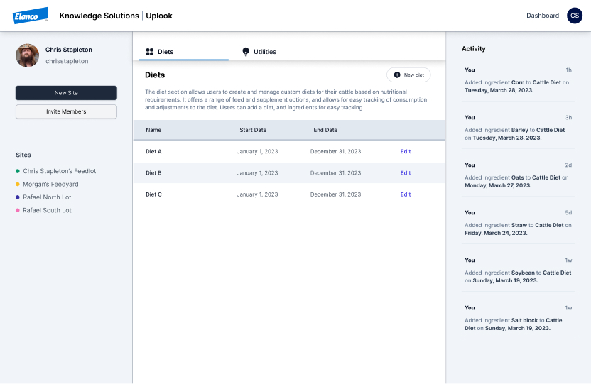
Because design, config, and Storybook shared one vocabulary, adoption needed no evangelism — an engineer read a Figma layer and already knew the class to write. The audit earned buy-in before the rebuild; the naming decision kept it without governance overhead. What shipped was a shared document design, engineering, and product could all cite without a decoder ring. The system became the base for the UpLook redesign and created the conditions for fast-moving work like ElancoGPT to feel coherent and trustworthy — a living component library that supports product work over time.
Every token & component named by its literal Tailwind class — zero translation layer.
Engineers already spoke the vocabulary; no bespoke naming system to learn.
Accessibility · interaction · snapshot · visual regression.
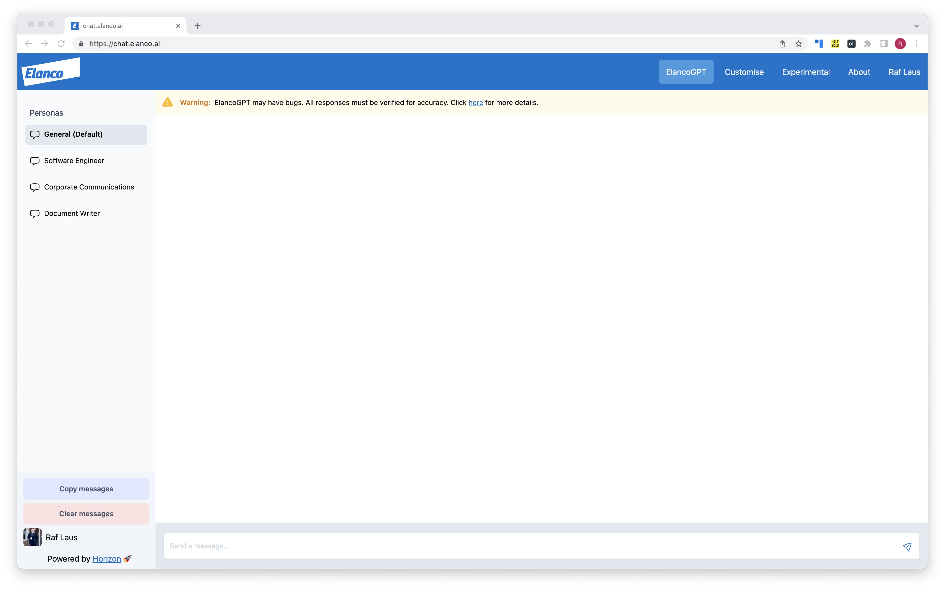
The shared vocabulary collapsed handoff: ElancoGPT designed in three days, shipped in ten.
ElancoGPT
Applied-AI product rendered entirely in CLIB v2 components — same tokens, same names, no new visual grammar.
Read the case → SH.02 Shipped on this systemUpLook
The EKS Modernization redesign on the same token sheet — whole products assembled from the system, with no bespoke styles.
Read the case →Choosing leverage over authorship.
The instinct is to design a bespoke naming system and own it. Borrowing Tailwind’s vocabulary meant the system had no author to route questions through — drift became structurally impossible, and any engineer was fluent on day one because they already spoke it. Restraint was the design decision.
Run discovery on the library itself, sooner.
CLIB v1 existed because components were extracted from wireframes without asking who needed them. I inherited that lesson instead of preventing it — the audit should have been a standing practice from v1, not a rescue mission at v2.